Novastream Graphic Design
- BrittGirlAus

- Mar 25, 2023
- 3 min read
Original Post June 2019
I’ve been working alongside Novastream since 2015 where I’ve written reviews, produced videos, and hosted podcasts. But there’s one thing I do for Novastream that doesn’t have my name in the byline: graphic design.
I have posted some previous images I have made for the online media site, but since then I’ve worked with Novastream to build a theme across some of their social media display photos, banners, and even star ratings for their reviews.
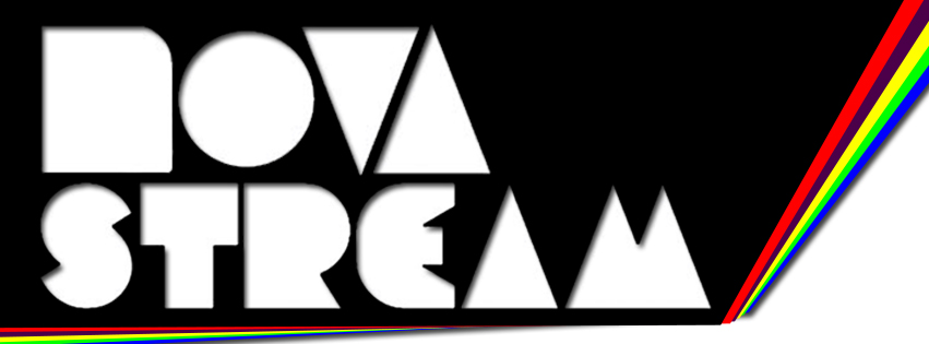
The original Novastream logo was sleek and neat, simple with it’s black and white design.

I especially liked how this font feels familiar but also unusual. It’s not difficult to see that the inverted triangles are either a ‘V’ or an ‘A’.
So, when I started creating logos and banners for Novastream, I chose to follow this design as a base and later incorporate some pop culture fun through the slight addition of colour.
Although no longer in use, I worked with the unique font to create titles for a puzzle page in their magazine and a logo for their movies podcast.


There was a lot of tracing and mistakes involved as I started to learn how to use photoshop. Because that was my major issue: I’ve had no formal training in graphic design with this program. The closest type of education I had was at school in year 9 with Adobe Illustrator.
From here I learnt how to change the canvas size of images to better fit the space it would fill. This was when I realised that canvas size greatly effects the design.
So far, the logos and banners had been landscape and long. But the next task was to create a logo for Novastream’s Issuu and some podcast accounts. The space for these logos is square and, in my opinion, didn’t work with wide designs or logos that we already had.
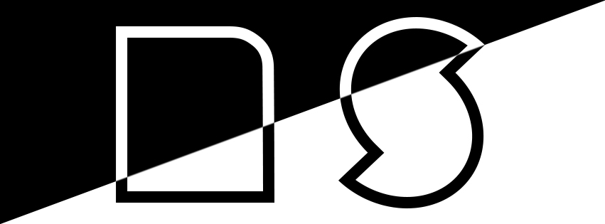
Novastream also needed smaller and more compact options for the logo, and so I took the prominent letters of the company name (N and S) while sticking with the now iconic font to create these:


There’s very little variation, but it kept with the monochromatic design that had previously followed Novastream's branding. The ‘N and S’ design went on to be incorporated into the Facebook display photo at one stage, although that final image was not designed by myself.
Shortly after, Novastream required a logo for a new morning podcast which could keep listeners up to date with big movies, TV, and gaming news. I worked closely with the host to create a design based on the intro sounds of grinding coffee beans as well as the host’s love for coffee.
I like to give my clients options with graphic design in order to create their vision. This works best as it isn’t always easy translating a concept to someone. We came to settle on a coffee cup lip with the podcast’s title ‘Morning Brew‘ written like it was a takeaway cup. It included the above ‘N and S’ to bring the podcast back to its umbrella company, and all that was left was a choice of background.


The ‘sunrise’ background was chosen, furthering the idea of the morning podcast.
This was particularly different from my previous designs for Novastream as it added the challenge of creating a seemingly 3D object. Not to mention the colour!
Colour was slowly becoming a part of the Novastream Logos and creating an interesting POP! for the designs. It actually started with an unused logo for a live series. Again, I sent through multiple options with the monochromatic title and a black base, but now it had colour fanning out from behind it. This went on to become the base for Novastream’s latest Facebook logo and many more designs.


Although only the square Novastream logo has been used, it has allowed for a theme to stretch across various images.
The most recent challenge was to design a unique star rating system for Novastream to use on reviews and in their magazine. Starting again from the monochrome title with the coloured fan, we arrived at this design:


The Star design required multiple images so that Novastream could plug whatever rating out of 5 into any image or movie poster. The unfortunate issue was the darkness of the shaded stars, which was solved by solely applying the stars over the poster without any shading.
Another design I made for Novastream is for a group chat attached to their Facebook page. Again, I sent through multiple designs and we agreed that the colour fan was the best option while staying true to the theme we’ve created.


It has been a joy working with Novastream. Follow the links throughout the article to see the designs in action and to see what other projects this amazing online magazine creates.
Site: Novastream Network


Comments